

- September 6, 2022
- Posted by: Tradingshot Articles
- Category: Stock Indices
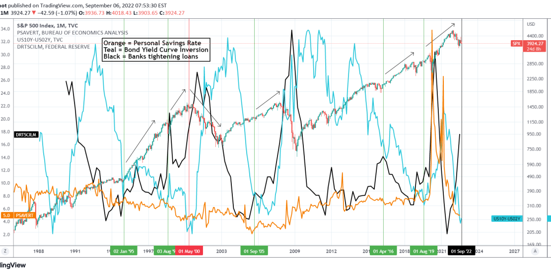
This is a cross asset technical analysis on the S&P500 Index (SPX) on the 1M (monthly) time-frame. The symbols included are the Personal Savings Rate (orange trend-line), the Yield Curve Inversion (teal trend-line) and the % of Domestic Banks tightening (black trend-line).
** Personal Savings **
A little background info on what each symbol means. The Personal Savings Rate is the income left over after people spend money and pay taxes. In other words, it is the percentage of the disposable income that people save.
** Yield Curve Inversion **
The Bond Yield Curve Inversion is when the US02Y turns at a higher rate than the US10Y and the curve inversion occurs. The shorter term US02Y is associated with short-term Fed policy while the US10Y takes into account the longer-term growth aspects of the economy. When the curve is inverted it essentially tells us that the bond market expects the Fed to tighten too much relative to the growth. Practically when it bottoms and starts rising, it is an indication that the economy might be headed towards a recession.
** Domestic Banks tightening **
That shows the net percentage of domestic banks tightening standards for commercial and industrial loans to large and medium sized firms. This is also an economic growth indicator.
** Today’s picture **
So basically what this chart shows is that since 1990, there have only been another 6 occasions of the above indicators forming the pattern we see today. That is a low Personal Savings Rate, Yield Rate Low and Bank tightening rising aggressively.
– The first was during January 1995 and that was half-way through the 1990s rally that led to the 2000 DotCom Crash.
– Second was in August 1998, two years before the market top.
– Third was in May 2000 at the peak of the DotCom Bubble.
– Fourth was in September 2005, half-way through the rally that led to the 2007/08 Housing Crash.
– Fifth was in April 2016, half-way through the incredible Bull Cycle we are at since the 2009 bottom and after the volatile months of the 2015 Grexit, China slowdown and 2016 Oil crisis.
– Sixth was in August 2019, right after the market had recovered from the U.S.-China trade war.
The common characteristic on all the above phases besides the the (third) 2000 peak, was that SPX was under heavy volatility, having sizeable pull-backs. Given that we already had a correction since Jan 2022 of almost 25%, this historical dataset shows that it is currently more likely that this pull-back is either in the middle or 2 years before a major recession.
Of course recessions can’t be predicted with 100% accuracy and as long as central banks are accommodative, Bull Cycles can be maintained, but this dataset is a fair guideline to where the stock market might be at relative to its Cycle stages.
Do you think this was a much needed correction and the market will resume its multi-year Bull Cycle or we are at the first stages of a Recession?
Tradingview link: