

- August 28, 2021
- Posted by: Tradingshot Articles
- Category: Cryptocurrency
Those who follow me since my start here on TradingView or even way back on Reddit know that I am a big fun fractal comparison. I have been using this approach extensively especially on long-term technical analysis and more often than not, proves to be quite efficient.
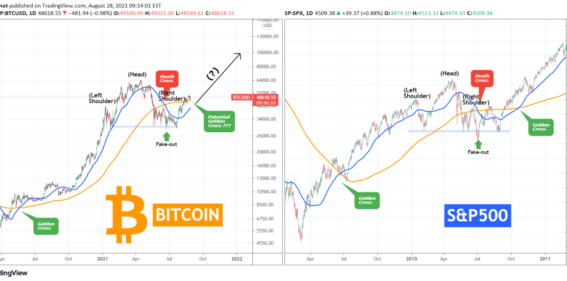
The fractal comparison I am bringing to you today is again a long-term one on Bitcoin’s last 18 month price action (after the COVID crash) against S&P500’s 18 month price action in 2009/2010 (after the subprime mortgage crash). Now, you will tell me (and rightfully so) what on earth does Bitcoin today have to do with S&P back in 09/10? The answer in practical terms may be ‘nothing’. I intend to present today’s fractal more for some fun weekend discussion and less for technical analysis and trend recognition. Theoretically though when market psychology comes into play, market structures across different asset classes tend to have more similarities than differences. This goes on to prove than under the pressure of panic, fear (or equally euphoria in bull cycles), the human reactions in seemingly different markets may be exactly the same.
Take this fractal for example. See the common market structures, Golden Crosses, Death Crosses, the Head & Shoulder patterns, even the fake-outs breaking of the Support before the rebounds, all seems quite similar between two very different assets. I am not implying that Bitcoin will continue in the same price action as S&P500 did in 2010, but that fractal certainly proves that it would have been an extremely useful for investors that were looking for markers to buy the Bitcoin dip this May – July.
What do you think about it? Is this to you just a fun fractal for weekend discussion or something more? Feel free to share your work and let me know in the comments section!
Tradingview link:
https://www.tradingview.com/chart/BTCUSD/4j1jcpqH-BITCOIN-fun-fractal-or-something-more