

- July 12, 2021
- Posted by: Tradingshot Articles
- Category: Cryptocurrency
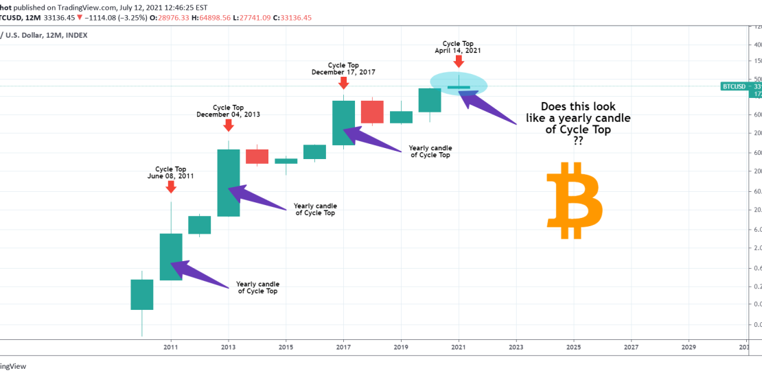
I’ve been meaning to post this chart for a while. There is no fancy technical or fundamentals analysis involved just a thought I wanted to share with the community and get your feedback.
This chart is on the 12M time-frame, meaning that each candle represents 12 months i.e. 1 year. As you see each of the previous Cyclical Peaks (Tops) have been on long/ strong (green) yearly candles mainly because they represented the parabolic phase of each Bull Cycle that takes place at the end of it and leads to the Blow-off Top and eventually the Bear Cycle.
The current yearly candle is almost flat (meaning close to the opening prices of January 2021) and the wide sentiment across the market is that Bitcoin will go lower, meaning that the candle may close in red. If that happens, it will be the first red yearly candle of a Cycle Top in BTC’s history.
So the question I ask is this: Does this (currently flat) candle look like a yearly candle of a Cycle Top? There are no right or wrong answers here, just share and support your view with arguments in the comments section!
Tradingview link: