

- March 20, 2020
- Posted by: Tradingshot Articles
- Category: Cryptocurrency
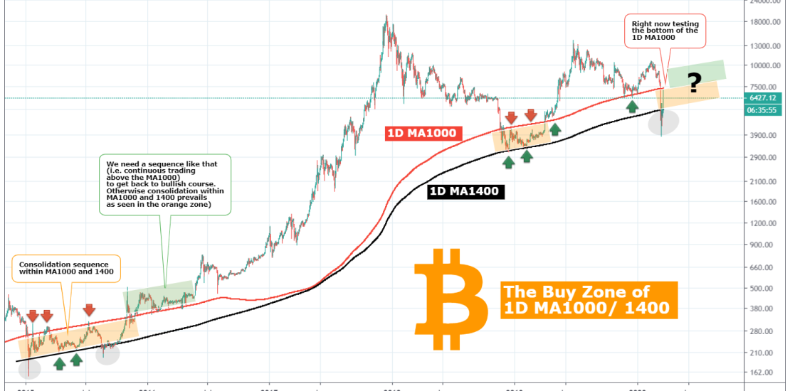
Not even 1 week passed since my article on the 1W MA300 and why that bounce (and the candle’s wick) could be key for Bitcoin’s future. The Buy Zone which on the 1W chart consisted of the MA200 and MA300, on the 1D chart is made of the MA1000 (red trend line) and the MA1400 (black trend line). I have mentioned that on previous studies but it has now become more relevant than ever.
** Not the first time the 1D MA1400 breaks **
As you see until last week and the cataclysmic sell-off (largely tied to Wall Street), the 1D MA1400 was intact and infact it held nicely from December 2018 to February 2019 and gave way to the 2019 rise.
However this is not the first time that the 1D MA1400 is broken to the downside. It happened twice in 2015: January 13 and August 23. Both (especially the first one) resulted into quick rebounds back within the Buy Zone (i.e. Buy Zone = 1D MA1000/1400).
** The first MA1400 break **
The first MA1400 break out may have been short lived but resulted into a 9 month consolidation (the orange Rectangle on the chart) within the Buy Zone before it finally broke above it and sustained a lengthy trading sequence above the MA1000. It can be argued though that the wick on that first break out was the bottom of the 2014 Bear Cycle, so it was only natural for Bitcoin to consolidate that much before it started making Higher Highs and Higher Lows.
** The second MA1400 break **
The first MA1400 break out occurred basically right before the end of this 9 month consolidation and even though after the wick bounce it traded on the MA1400 for 1 month, it then started an aggressive rise above the Buy Zone and consolidated having the 1D MA1000 as a support for 7 months (the green Rectangle on the chart). That was practically the start of the new Bull Cycle.
** Where are we now? The 1D MA1000 is the key **
It is too early to tell, even though the current volatility resembles more the first break out of January 2015. Does this mean we have 9 months of upward consolidation ahead of us? Could be. But I personally think the key is the 1D MA1000 (red line). If Bitcoin breaks above it (today it got close to it) and makes it a support then we’ll know that we have a “Green Rectangle” scenario ahead of us. Don’t forget though that as last week showed us, this depends largely upon the global fundamentals and how smoothly societies and governments can withstand the Coronavirus pandemic.
So which of the two scenarios seem more reasonable to you, orange or green? Let me know in the comments section!
Please like, subscribe and share your ideas and charts with the community!
** BONUS MATERIAL on why fractals cannot be ignored (idea posted in September 2019):
